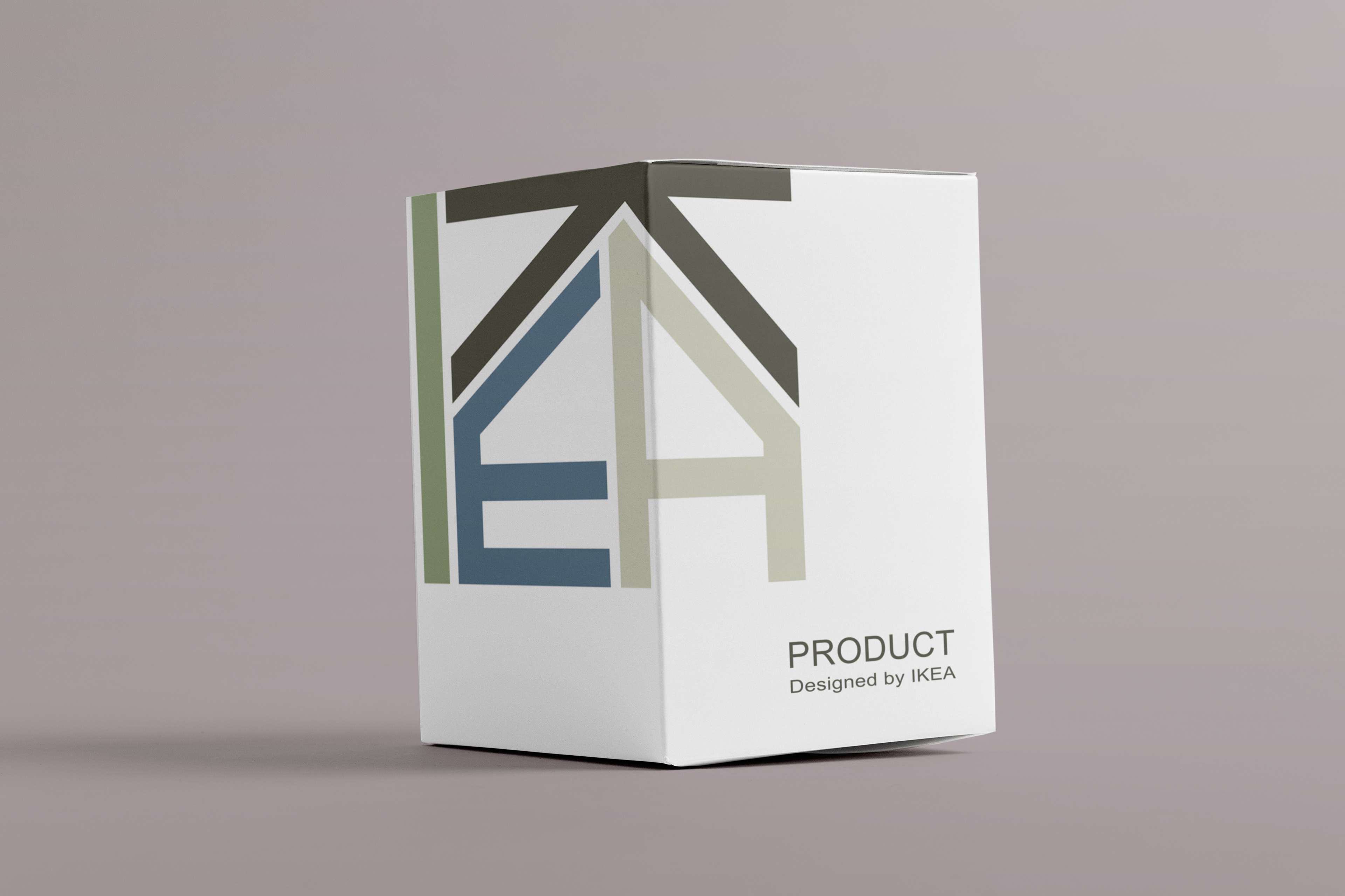

This logo recreation uses IKEA as a framework to explore how visual identity can communicate brand values beyond recognition alone. By pairing simplified logo forms with an earthy, organic color palette, the project highlights IKEA’s roots, sustainability efforts, and commitment to functional design. The work prioritizes concept-driven branding over surface-level aesthetics. Tools: Adobe Illustrator · Skills: Brand Strategy, Logo Design, Color Systems, Visual Storytelling

